

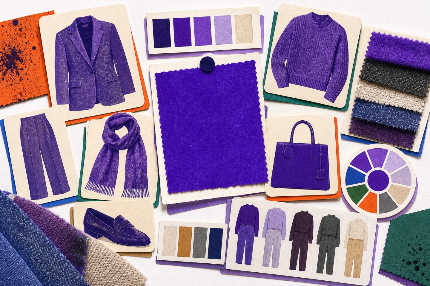
Colour of the Year Fashion
An annual colour can offer fresh styling ideas, but it does not need to dictate a wardrobe. The useful question is not whether a shade is fashionable. It is whether that shade works with your clothes, colouring and daily routine.
Treat the chosen colour as a prompt rather than a rule. You can wear an exact match, a lighter or darker version, or a neighbouring tone that feels more natural. Starting with familiar shapes and dependable combinations makes the idea easier to use beyond one season.
Understand the Colour Before Buying It
Annual shades are selected by forecasting groups that study recurring colours across clothing, interiors, culture and visual media. The announcement gives designers and retailers a shared reference, but it does not make every version of the colour equally wearable. Fabric, finish and surrounding colours can change its effect considerably.
Begin by describing the shade accurately. Is it warm or cool, pale or deep, clear or muted? A warm red leans towards orange; a cool red leans towards blue. A muted green contains more grey than a vivid green. These distinctions are more useful than the shade's fashionable label because they reveal which existing clothes will support it.
Next, check the colour in daylight. Artificial lighting may make it appear brighter, duller, warmer or cooler. Hold the garment near your face, then compare it with a similar item you already wear often. If the colour makes your complexion look uneven or tired, move it away from the face and use it for trousers, a skirt, shoes or a bag.
Choose a Comfortable Level of Colour
You do not have to wear the shade from head to toe. Choose a level that fits your usual style and the settings in which you dress.
- Small accent: socks, a scarf, a belt, jewellery or a compact bag. This is the simplest way to test an unfamiliar colour.
- Supporting piece: a shirt, knit, skirt or trousers worn with established neutral basics.
- Main piece: a coat, suit, dress or matching set that makes the colour the focus.
Keep the silhouette familiar when the colour feels bold. A bright crew-neck jumper is easier to repeat if crew-neck jumpers already suit your wardrobe. Likewise, a colourful blazer will be more useful in the same cut and weight as one you already enjoy wearing. Novelty in both colour and shape often makes an item harder to combine.
Build Reliable Colour Pairings
Neutral colours provide the safest starting point. White and cream lighten a deep shade. Charcoal, navy and black give a bright shade a firm frame. Camel, tan and chocolate brown soften warm colours, while cool grey works particularly well with blue-based tones. Denim can act as a neutral when its wash does not compete for attention.
Try one of these straightforward formulas:
- A coloured knit with dark denim, plain shoes and a neutral coat.
- A coloured shirt with charcoal trousers and a simple belt.
- A coloured skirt with a cream top and brown or black footwear.
- A coloured jacket over a white T-shirt and navy trousers.
- A neutral outfit finished with one coloured bag, scarf or pair of shoes.
For stronger contrast, use one opposing colour in a small area rather than dividing the outfit into several competing blocks. A cool blue can take a restrained warm accent; a green can sit beside a red-based detail. Repeat neither colour unnecessarily. The main shade should remain easy to identify.
Tonal dressing is another practical option. Combine pale, medium and deep versions from the same colour family, then separate them through texture. A soft knit, crisp cotton shirt and suede shoe can look distinct even when their colours are close. If the result feels flat, add one quiet neutral such as dark brown, navy or stone.
Use Fabric and Texture Deliberately
The same colour behaves differently across materials. Satin, patent finishes and smooth leather reflect light, so they make a shade look brighter and more formal. Cotton, wool, denim and suede absorb more light and usually make it calmer. Fine knits appear neater; brushed or textured yarns create softer colour variation.
Use this effect to control intensity. If a vivid colour feels too loud in a glossy dress, it may be comfortable in a wool jumper or washed cotton shirt. If a muted colour looks dull in jersey, it may gain definition in a structured twill jacket. Texture can also separate similar colours in a tonal outfit without adding another hue.
Adapt the Shade Across the Year
In spring and summer, lighter fabrics and open space keep a featured colour from feeling heavy. A linen shirt can sit with cream trousers or faded denim. A cotton skirt works with a plain vest and flat sandals. For a more structured outfit, place a lightweight coloured blazer over a white top and simple trousers.
In autumn and winter, the shade can move into knitwear, tailoring and outer layers. Wear a coloured jumper over a pale shirt with dark trousers, or place a coloured roll-neck beneath a charcoal coat. A scarf or hat can echo the main colour without matching it exactly. Weather-resistant shoes and a practical coat should remain the functional foundation.
Layering also helps a bright shade feel controlled. Let only the collar and cuffs of a colourful shirt show beneath a neutral jumper, or allow a knit to appear between a dark coat and trousers. A muted shade can take up more space because it creates less visual contrast.
Shop for Repeat Wear
Before buying, identify three outfits you can make with clothes you already own. Name the actual garments rather than imagining general categories. If a jacket only works with a future pair of trousers, future shoes and a different coat, it is not yet a useful addition.
Check the garment as carefully as you would any long-term basic:
- Examine seams, hems, fastenings and lining for secure construction.
- Move, sit and raise your arms to test comfort and fit.
- Read the care requirements and decide whether they suit your routine.
- Check whether the fabric is likely to snag, crease or show marks in normal use.
- Compare the colour with the neutrals and outerwear you wear most often.
A simple shape usually lasts longer in rotation than a piece combining a trend colour with conspicuous trims, cut-outs or exaggerated proportions. Accessories are useful for experimentation, but they still need a purpose. A coloured bag that is too small for daily essentials will not become practical simply because the shade is appealing.
Refresh What You Already Own
A new purchase is not the only way to use an annual colour. Start by looking for a similar shade in your wardrobe. An older scarf, shirt or pair of shoes may feel current when combined with different neutrals. Moving a colourful item from occasion wear into a simple daytime outfit can also make it more useful.
Repairs and alterations may restore pieces that have dropped out of use. Replace missing buttons, mend a hem, shorten trousers or adjust a sleeve before deciding an item no longer works. Dyeing can refresh some plain natural-fibre garments, but fibre content, stitching and existing stains affect the result, so follow the dye instructions and test cautiously.
When you no longer wear an item, choose an appropriate route for it. Clean garments in good condition may be sold or donated. Worn textiles may be accepted by a local textile collection scheme. Repairable pieces are worth separating from material that has reached the end of its useful life.
Make the Trend Personal
Photographs from fashion shows and social feeds can suggest proportions and combinations, but they are references rather than instructions. Notice whether the colour appears as a full outfit, a layer or a small accent. Then translate that balance into garments suitable for your climate, work and everyday movement.
Wear a trial outfit at home before committing to it for a full day. Check it in daylight, take a photograph and make sure every layer works when the coat or jacket comes off. If the colour seems overpowering, reduce its area or choose a softer version. If it disappears, add contrast through a lighter neutral or a clearer texture.
The most successful use of a colour trend is repeatable. Choose a shade and scale that fit your wardrobe, combine it with dependable pieces, and care for it well. When the annual label changes, the garment should still earn its place through fit, function and combinations you genuinely enjoy.
Take this further with MiraAI on the App Store.