

March Wedding Colours: A Practical Guide
March sits between winter and spring, so its most useful wedding palettes balance both seasons. Cool light, bare branches and uncertain weather can suit deeper neutrals, while early flowers introduce softer greens, pinks, blues and yellows. The aim is not to make every detail look springlike. It is to choose a small group of colours that works with the venue, available flowers, clothing and light.
A reliable starting point is one main colour, one supporting colour and one neutral. Add a metal only if it has a clear purpose. This simple structure keeps invitations, flowers, attire and reception details related without making them identical.
Start with the venue and the light
Look at the colours already present before choosing a palette. A room with dark timber, patterned carpet or coloured walls will affect pale shades. A conservatory, stone hall or simple restaurant may offer a quieter background. Outdoors, early lawns can be dull and trees may still be bare, so a palette that depends entirely on fresh green surroundings may not read as planned.
Test fabric, paper and flower samples at the venue at roughly the time the ceremony or reception will take place. Dusty blue can appear grey in weak light, while lavender may become pink under warm bulbs. Photograph the samples with and without flash. The result matters more than a colour shown on a phone screen.
Weather also changes what guests see and wear. Deep green, navy, plum and charcoal remain clear on an overcast day. Blush, ivory and pale yellow are useful for smaller details and flowers. If part of the day is outdoors, include layers and suitable footwear in the dress guidance rather than expecting colour alone to make an outfit seasonal.
Three adaptable March palettes
Sage, ivory and butter yellow
Sage gives an early-spring impression without relying on bright foliage. Ivory softens it, and butter yellow adds warmth in small areas. Use sage for napkins, attendants' clothing or stationery ink; ivory for larger surfaces; and yellow in flowers, ribbons or candles. Natural timber, clear glass and matte ceramics suit this combination better than several competing metallic finishes.
Tulips, daffodils, hellebores and leafy stems can support the palette, subject to local availability. Ask the florist for the overall colour effect rather than an exact variety. Flowers vary naturally, and substitutions are easier when the brief describes tone and shape.
Dusty blue, blush and warm grey
This is a useful choice for a light indoor venue or a formal daytime event. Dusty blue can lead through clothing or stationery, blush can appear in flowers, and warm grey can ground suits, linens or type. Keep ivory close to the face in bouquets or table settings if the two pastels begin to look flat together.
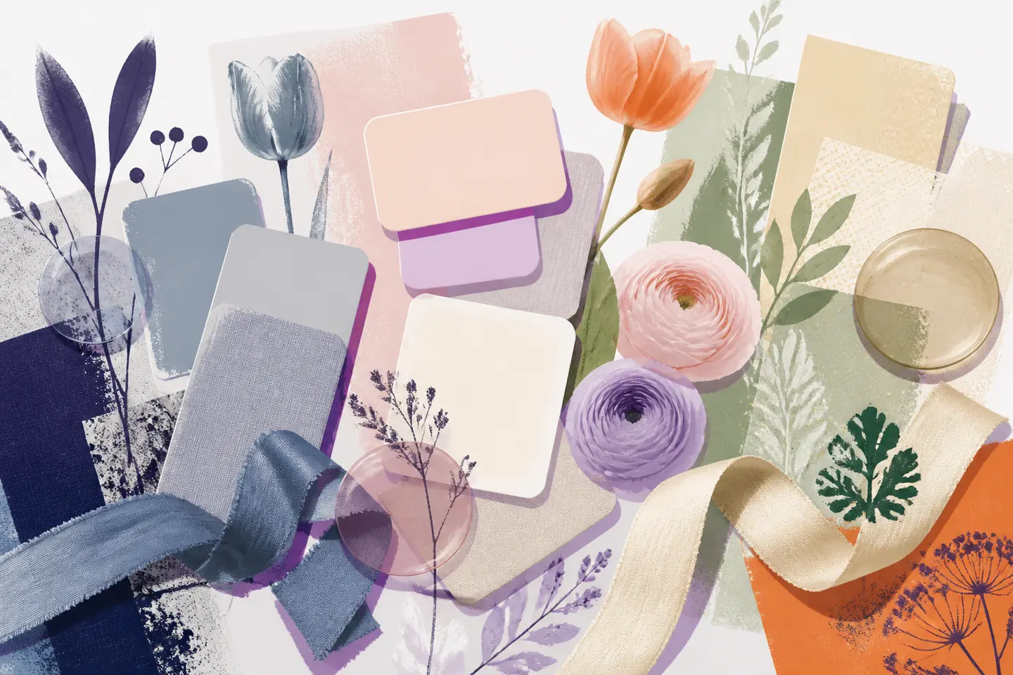
The strongest ideas in seasonal wedding color palettes are adaptable because they show colour across several materials rather than as isolated swatches. Apply that principle selectively: repeat dusty blue in two or three visible places, then let blush and grey support it.
Plum, mauve and stone
For an evening celebration or a room with strong architecture, plum offers depth while mauve provides a softer bridge to spring. Stone prevents the scheme from becoming wintry. Reserve plum for focal points such as attendants' clothing, taper candles or a small group of flowers. Use mauve in paper goods and textiles, with stone or warm white across the largest surfaces.
Dark shades need space around them. A plum tablecloth, dense dark flowers and heavy chairs can overwhelm one table. Instead, place the darkest colour where it can repeat at intervals. Examples of Spring wedding palettes beyond traditional pastels can help when a couple wants seasonal colour without an all-pastel result.
Build a balanced colour scheme
Choose the main colour for the elements that occupy the most visual space, such as attendants' clothing or table linen. The supporting colour should appear in medium-sized details, including bouquets, napkins and envelopes. The neutral belongs on backgrounds, tableware, ceremony fabric and other areas that need to connect the scheme.
Do not force every supplier to match one digital colour value. Silk, wool, paper, paint and petals reflect light differently. A family of related tones usually looks more deliberate than several imperfect attempts at an exact match. Collect physical samples and view them together before approving orders.
Metallics act as finishes, not extra main colours. Brushed gold or brass can warm blush, yellow and plum. Silver or pewter can sharpen blue, grey and cool green. Choose one finish and repeat it sparingly on candleholders, frames or small stationery details. Rustic settings may need no metal at all; wood, linen and glass can provide enough contrast.
Apply colour where it matters
Attire
Attendants do not need identical shades. Related greens, blues or mauves can work well if the fabric weight and formality feel consistent. For suits, navy, charcoal and mid-grey are flexible bases. A tie, pocket square or buttonhole can carry the supporting colour without turning the whole outfit into a colour statement.
Consider comfort as part of the palette. March may require a coat, wrap or jacket, and these layers will appear in arrival photographs and outdoor portraits. Include them in the plan instead of treating them as emergency additions. Shoes should suit damp ground if the ceremony or photographs take place outside.
Flowers and ceremony details
Ask which flowers and foliage are dependable locally in March, then design around the answer. Tulips, ranunculus, anemones, hyacinths, hellebores, daffodils and sweet peas may be available, but season and supply vary by region. A flexible brief might request loose ivory and pale-yellow flowers with fresh green foliage, rather than insisting on a particular bloom.
Give the ceremony one clear focal area. An aisle arrangement, grouped floor flowers or an asymmetric structure usually needs less competing decoration elsewhere. Move suitable arrangements to the reception if practical, but decide this before the day so containers, access and timing are accounted for.
Tables and stationery
Stationery introduces the palette before the wedding. Use a neutral card stock, one main ink colour and perhaps one small supporting detail. At the reception, repeat the same hierarchy: neutral linen, coloured napkins and flowers that contain the main and supporting shades. Menus and place cards can use the same type and ink without copying the invitation layout.
Keep large areas calm when the flowers are varied. Ivory, oatmeal, stone and soft grey allow brighter arrangements to remain the focus. If the tables have a strong natural surface, leave some of it visible rather than covering it simply to add another colour.
Cake and smaller details
A cake does not need to reproduce the whole palette. An ivory finish with one coloured ribbon, painted detail or small floral group is often enough. Any fresh flowers used on food should be confirmed suitable and prepared by the relevant professionals.
Use smaller details to reinforce colours already established, not to introduce new ones. Candles, signs, ribbons and favour packaging can each repeat a shade, but using all of them at once creates clutter. Choose the details guests will notice in the room and leave the rest neutral.
Give guests clear colour guidance
The invitation should state the dress code first. If colour guidance is important, put it on the wedding website with a short description such as muted spring tones or dark formal colours. Avoid asking guests to locate an unusually precise shade. Useful guidance also mentions grass, gravel, cold rooms or time spent outdoors.
Guests generally avoid white, ivory and very pale cream unless the couple requests them. They should also avoid matching the wedding party deliberately if its colour has been announced. Navy, soft green, dusty blue, mauve, plum and restrained floral prints can suit March, but venue and formality take priority over season.
A final check before ordering
Lay out every confirmed sample together: clothing fabric, paper, linen, ribbon and representative flowers. Remove anything that introduces an unnecessary fourth or fifth colour. Check the group in daylight and venue-like artificial light, then photograph it. These spring wedding palette options can provide comparisons, but the venue samples should decide the final choice.
Record where each colour will appear and share that short list with the relevant suppliers. A clear plan might specify dusty blue for attendants and envelopes, blush for flowers, warm grey for suits and linen, and brushed silver for small hardware. Once every colour has a job, stop adding alternatives. Consistency comes from repetition and proportion, not from colouring every available detail.