
Wedding Guest Dress Colours: Read the Dress Code Before the Palette
Choosing wedding guest dress colors starts with the invitation, not a list of fashionable shades. The same blue dress might feel right at a garden ceremony and too relaxed at a formal evening reception. A colour that suits the season might conflict with a request from the couple. Begin with what this wedding asks of its guests, then choose a shade you enjoy wearing.
Start with the instructions you have
Read the invitation and wedding website closely. A named dress code carries more weight than a seasonal colour rule, and a stated guest palette is more useful than a guess based on the flowers. Wedding stylist Beth Chapman, speaking to The Knot about guest colours, recommends using the dress code to judge what is appropriate: black tie usually calls for a more restrained, formal choice, while cocktail, semi-formal and casual events allow greater flexibility.
That does not mean every black-tie guest must wear a dark dress, or every daytime guest a pastel. Cut, fabric and finish matter alongside colour. A saturated blue in a formal fabric may fit an evening event better than a black cotton sundress.
Black and red deserve the same whole-outfit test. Black may look entirely appropriate at a formal evening reception, but a heavy, sombre outfit can feel out of place at an informal daytime celebration. Red is not automatically forbidden; its brightness, fabric and the hosts’ guidance matter more than a blanket rule. If an invitation specifies a palette, follow it even when another colour would usually suit the dress code.
If the couple asks guests to wear or avoid a particular shade, follow that request where you reasonably can. If it is unclear whether a colour is required or suggested, check the wedding website or ask the person handling guest questions.
Let the setting narrow your choices
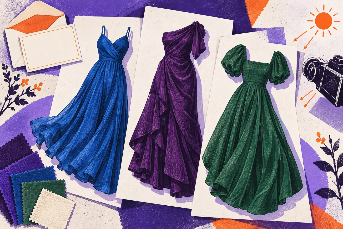
Venue and season are useful clues after the dress code. Deep navy, forest green, plum or rust can suit a formal indoor setting. Clear blue, coral or a richer floral print can work outdoors. These are possibilities, not a calendar assigning colours to guests.
Consider the fabric as well. A pale, fine cloth may feel flimsy at a winter evening event. A heavy dark dress can feel uncomfortable in direct summer sun. Check shoes, a layer and how the dress moves: you need to wear the complete outfit through the ceremony and reception.
Lighting can change the impression of the same colour. A muted shade may appear clearer outdoors than in a dim reception room; a glossy fabric can look brighter under indoor lights than it does at home. Compare your options in the kind of light you expect, but do not try to match a photograph of the venue exactly. Comfort and the stated dress code remain better guides.
Season can guide the version of a colour rather than decide whether you may wear it. Pink can be raspberry or rose; green can range from fresh leaf to olive or emerald. Blue can be bright, slate or navy. You may already own a suitable shade.
Treat near-white shades with care
Ivory, cream, very light beige and some blush or silver fabrics can read as white from a distance or in photographs, particularly when the outfit is mostly one pale tone. The Knot’s guidance on wearing white to a wedding advises guests to avoid shades that may photograph as white.
Look at the garment as a whole, rather than its label. A retailer may call a dress “champagne” or “pale stone,” but those words cannot tell you how light it looks across a room. An ivory background with a small print may still look predominantly ivory. A darker print spread across the whole garment creates a different impression. If you keep having to explain why a dress is technically not white, choose the easier option.
The same check applies to a pale jacket or shawl worn over a darker dress. If the light layer covers most of what other guests will see during the ceremony, assess the outfit with that layer on. You can also check whether the wedding party’s colours have been shared. There is no need to guess at an unpublished palette, but an obvious match to a stated attendant colour is easy to avoid.
A couple may explicitly ask guests to wear white or another light colour. Follow their request rather than a general convention. Do not assume that one Western approach to white applies to every wedding.
Respect customs without turning them into universal bans
Colour can carry meanings beyond formality. The Metropolitan Museum of Art’s exhibition of wedding attire from three cultural settings shows how fabric, colour and decoration have held particular meanings in different places and periods. It is a reminder to pay attention to the people and ceremony in front of you, rather than rely on a blanket rule about red, black, white or any other colour.
Do not infer a dress code from a couple’s names, heritage or invitation design. Families may observe a custom closely, adapt it or have no colour expectations for guests. If you know a colour has a ceremonial role and are uncertain about wearing it, ask discreetly through the guest contact.
A simple colour and lighting decision tree
When two dresses seem suitable, run them through these questions in order.
- Is there an explicit instruction? Follow the dress code and any stated colour request. Set aside an option that conflicts with either.
- Does the whole outfit meet the level of formality? Judge the fabric, shape and finish as well as the shade. A suitable colour cannot make an overly casual dress formal.
- Could it be mistaken for bridal or attendant clothing? Check very pale outfits and any attendant colours the couple has shared. If the resemblance is strong, choose another dress.
- Does it suit the venue and conditions? Consider daylight, evening light, temperature, ground underfoot and any layer you will wear over it.
- How does it look in a quick photograph? Check the outfit in daylight and ordinary indoor light, without filters. If a pale shade loses its colour in one of those views, pick a more distinct shade.
- Can you wear it with ease? Once both options pass the other checks, choose the one you can sit, move and celebrate in comfortably.
A photograph is a check, not a prediction of the wedding gallery. Adobe’s explanation of white balance describes how light sources and camera settings affect recorded colours. Notice whether your dress remains distinct from white in more than one everyday lighting condition.
Apply the checks to real choices
Suppose the invitation says cocktail attire for an early autumn wedding. You have a cream dress with a small blue print, a navy dress and a deep green dress. The cream option may be the least straightforward because its light background dominates. Navy and green both offer clear colour; compare their fabrics, fit and the venue before deciding. There is no need to find an official “autumn wedding colour” to break the tie.
If both darker dresses satisfy the invitation, try each with the shoes and outer layer you intend to wear. A thin green dress with no suitable layer may be less practical for a cool outdoor ceremony than a navy dress that works with a coat you own. At an indoor reception, that difference may disappear. The season informs these practical choices; it does not make either colour wrong.
At a spring garden wedding requesting bright colours, a dusky pastel may suit the weather but miss the couple’s preference. A stronger blue or pink answers the invitation more directly. For an evening event with no colour request, a well-cut dark dress is one of several workable choices.
A Swedish-language catalogue such as www.hersecret.se can help you compare dress colours, but shop photos do not settle how pale a fabric will look at the event. Follow the couple’s guidance and check the garment in natural light.